CSS Design
fonts · content · images · classes · folding editor · sidebar · float
Setup
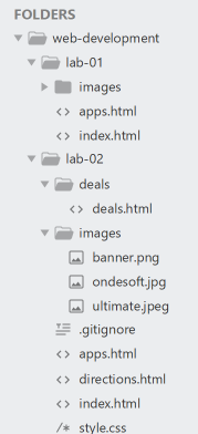
This week we wil start a new project, and we will seed it with the project as we completed it last week. Your web development workspace might look like this (if opened as a Sublime folder):
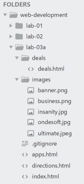
This is the project as we left it last week (including some extra material prompted by the exercises):
Create a new folder called lab-03a now, and either:
- unzip the solution above OR
- duplicate your lab-02 project (if you completed the exerises)
Either way, this is how the workspace should look like this now:
If you have room, also open the Chrome web browser side by side:
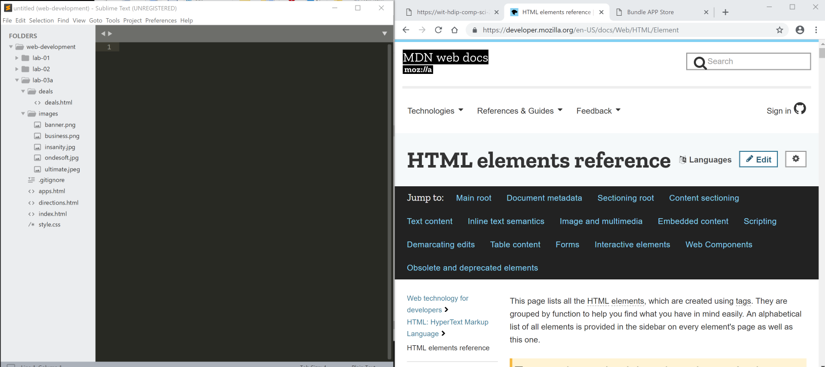
In the above, we are keeping a tab of the browser open at
- Our Lab instructions (this page)
- The HTML Reference (MDN) https://developer.mozilla.org/en-US/docs/Web/HTML/Element
- The index.html in lab-03a
The Mozilla foundation are an excellent source of reference information on all things web - and it is useful to keep the html reference site open to occasionally check that your are using the correct structure for your elements.
Main page
lab-03a/index.html
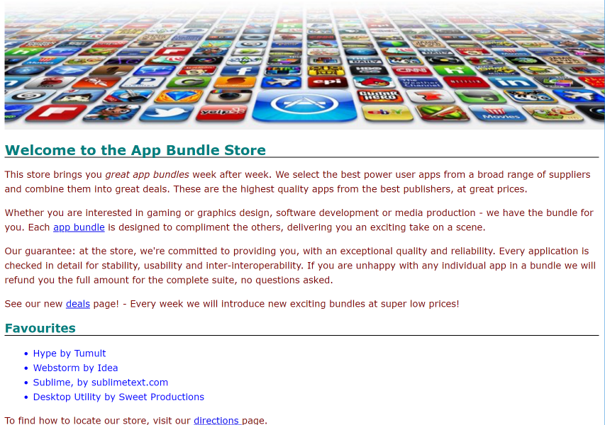
Open the main index.html page and introduce the following as the third paragraph on the page:
   <p>
      Our guarantee: at the store, we're committed to providing you,
      with an exceptional quality and reliability. Every application is checked in detail
      for stability, usability and inter-interoperability. If you are unhappy with any
      individual app in a bundle we will refund you the full amount for the complete suite,
      no questions asked.
    </p>
... and open this same file in the browser:
Any change you make in the sublime will only appear in the browser if you:
- save the changes in sublime
- refresh the page in chrome.
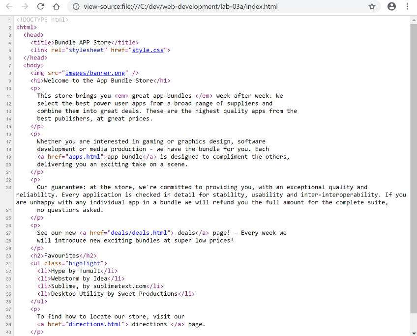
Additionally, chrome has some interesting features to let you explore the page 'source'. The simplest one is to just right click anywhere in the browsers and select View Source:
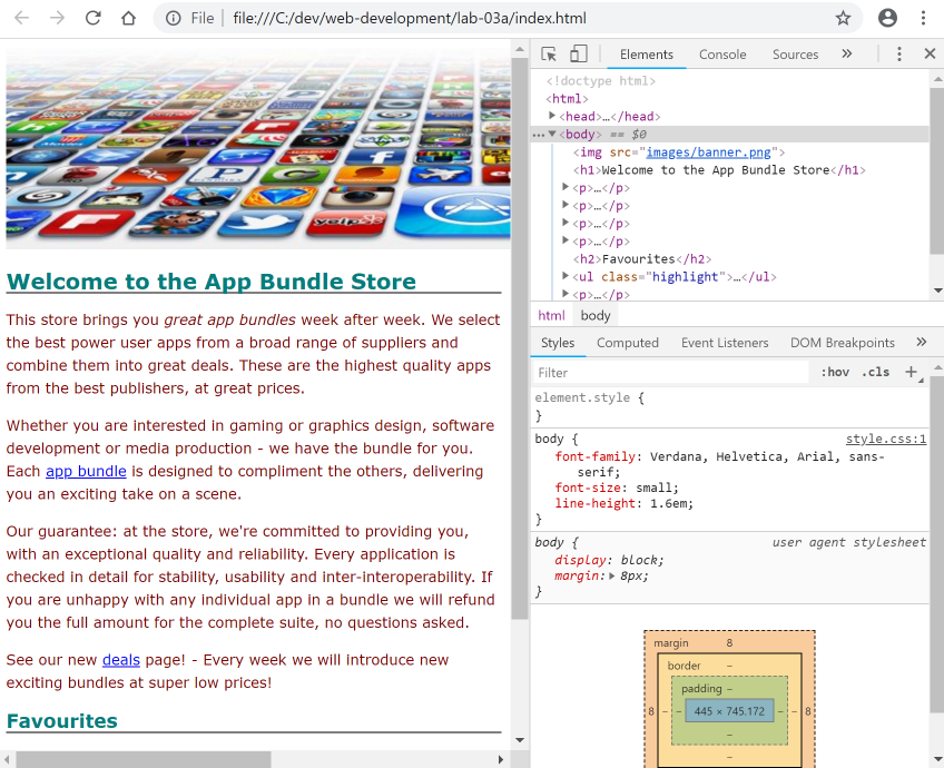
A more sophisticated option is to use Developer Tools:
To reproduce the above, first close the source view we just opened above, and proceed to access the tools as shown here:
Explore the developer tools for a little while - notice how the box model seems to be visible. Then close it, we will return to it later.
Guarantee Paragraph
Locate the 'guarantee' paragraph in the home page (the third paragraph we just inserted):
    <p>
      Our guarantee: at the store, we're committed to providing you,
      with an exceptional quality and reliability. Every application is checked in detail
      for stability, usability and inter-interoperability. If you are unhappy with any
      individual app in a bundle we will refund you the full amount for the complete suite,
      no questions asked.
    </p>
We would like to target this specific paragraph with some custom styles. To this end, we nominate it to a 'class' called 'guarantee':
    <p class="guarantee">
      Our guarantee: at the store, we're committed to providing you,
      with an exceptional quality and reliability. Every application is checked in detail
      for stability, usability and inter-interoperability. If you are unhappy with any
      individual app in a bundle we will refund you the full amount for the complete suite,
      no questions asked.
    </p>
In our stylesheet, we can devise a rule just for this paragraph:
.guarantee {
  border-color: black;
  border-width: 1px;
  border-style: solid;
  background-color: #a7cece;
}
Append this rule to the end of the style.css file, and reload and review how the paragraph looks:
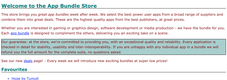
We can see evidence of our targeted styles.
We can add a little margin:
.guarantee
{
  ...
  margin: 30px;
}
Note that ... above means leave the existing properties in place and just add the margin to the end of the 'guarantee rule.
Reload the page:
Notice the box model property coming into effect.
Background Image + Margins
Next, the background image. Save this image here to your images folder:

...and we can extend the guarantee rule with this property here:
.guarantee
{
  ...
  background-image: url(images/background.gif) ;
}
This seems to yield a repeated pattern:
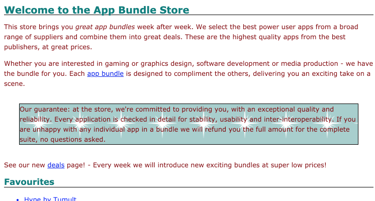
Some further refinements to the same rule can put a single image in the top right:
  background-repeat: no-repeat;
  background-position: left;
Reloading again:
And we can also further refine the padding:
  padding: 25px;
  padding-left: 80px;
  margin-right: 150px;
Looks like this:
Our full rule for guarantee now looks like this:
.guarantee {
  border-color: black;
  border-width: 1px;
  border-style: solid;

  background-color: #a7cece;
  background-image: url(images/background.gif);
  background-repeat: no-repeat;
  background-position: left;

  margin: 30px;
  padding: 25px;
  padding-left: 80px;
  margin-right: 150px;
}
We have grouped related properties
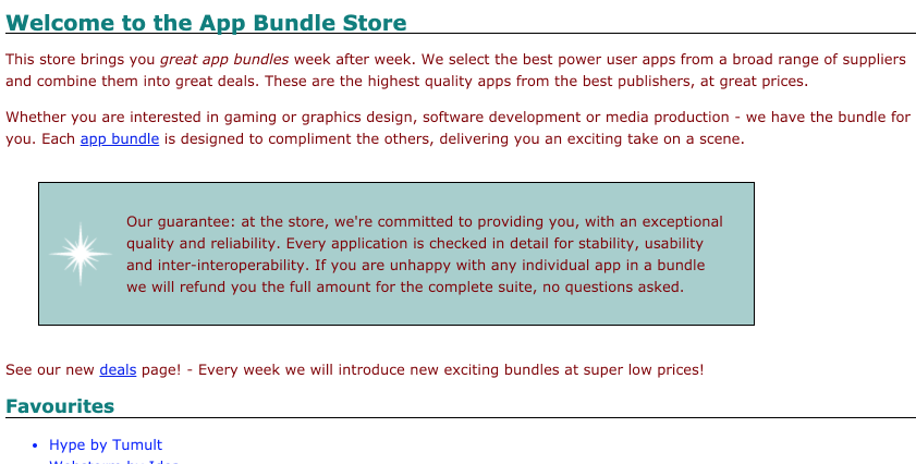
Line height, font and borders
Still working, on the guarantee rule, some further adjustments to the text itself:
  line-height: 1.9em;
  font-style: italic;
  font-family: Georgia, "Times New Roman", Times, serif;
  color: black;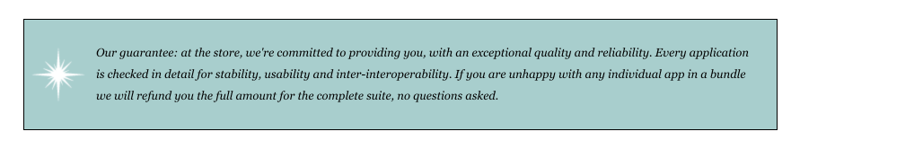
Finally, we might adjust the border pattern:
  border-color: white;
  border-width: 1px;
  border-style: dashed;
Which turns out as:

Regrouping the properties, this is the complete rule:
.guarantee {
  border-color: black;
  border-width: 1px;
  border-style: solid;

  background-color: #a7cece;
  background-image: url(images/background.gif);
  background-repeat: no-repeat;
  background-position: left;

  margin: 30px;
  padding: 25px;
  padding-left: 80px;
  margin-right: 150px;

  line-height: 1.9em;
  font-style: italic;
  font-family: Georgia, "Times New Roman", Times, serif;
  color: black;

  border-color: white;
  border-width: 1px;
  border-style: dashed;
}
Div
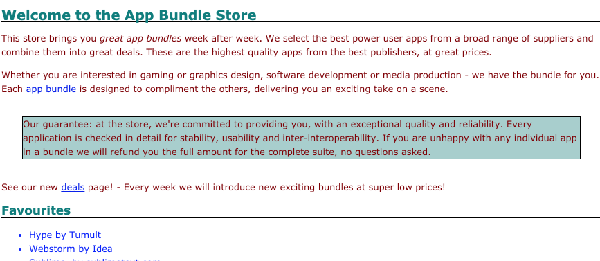
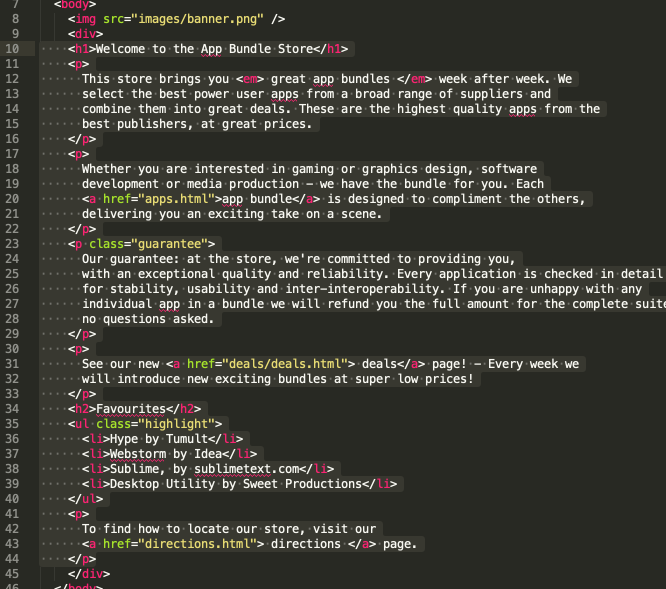
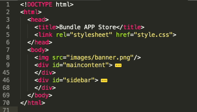
Open the main index page and introduce a new div> element, wrapping most (but not all) elements in <body>
<body>
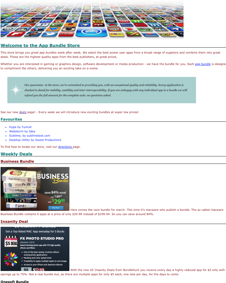
<img src="images/banner.png" />
<div>
<h1>Welcome to the App Bundle Store</h1>
<p>
This store brings you <em> great app bundles </em> week after week. We
select the best power user apps from a broad range of suppliers and
combine them into great deals. These are the highest quality apps from the
best publishers, at great prices.
</p>
<p>
Whether you are interested in gaming or graphics design, software
development or media production - we have the bundle for you. Each
<a href="apps.html">app bundle</a> is designed to compliment the others,
delivering you an exciting take on a scene.
</p>
<p class="guarantee">
Our guarantee: at the store, we're committed to providing you,
with an exceptional quality and reliability. Every application is checked in detail
for stability, usability and inter-interoperability. If you are unhappy with any
individual app in a bundle we will refund you the full amount for the complete suite,
no questions asked.
</p>
<p>
See our new <a href="deals/deals.html"> deals</a> page! - Every week we
will introduce new exciting bundles at super low prices!
</p>
<h2>Favourites</h2>
<ul class="highlight">
<li>Hype by Tumult</li>
<li>Webstorm by Idea</li>
<li>Sublime, by sublimetext.com</li>
<li>Desktop Utility by Sweet Productions</li>
</ul>
<p>
To find how to locate our store, visit our
<a href="directions.html"> directions </a> page.
</p>
</div>
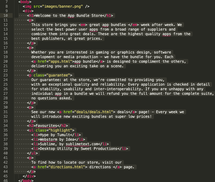
</body>Notice the indentation - where each element is to move in by 2 spaces consistently, is not followed above: the elements inside <div> should be indented. We can do this easily in sublime as follows.
First, select all the elements inside the div:
The press 'tab' once, it should move the elements in 2 spaces, preserving the indentation of the enclosed elements.
Still in sublime, experiment with the 'folding' behaviour by folding the entire <div>
This is triggered by hovering the pointer over the left margin until arrows appear, and then using these arrows to alter how the editor displays the html. This, of course, is just a convenience feature - the actual text is not altered. Explore the Edit->Code Folding submenu for more options.
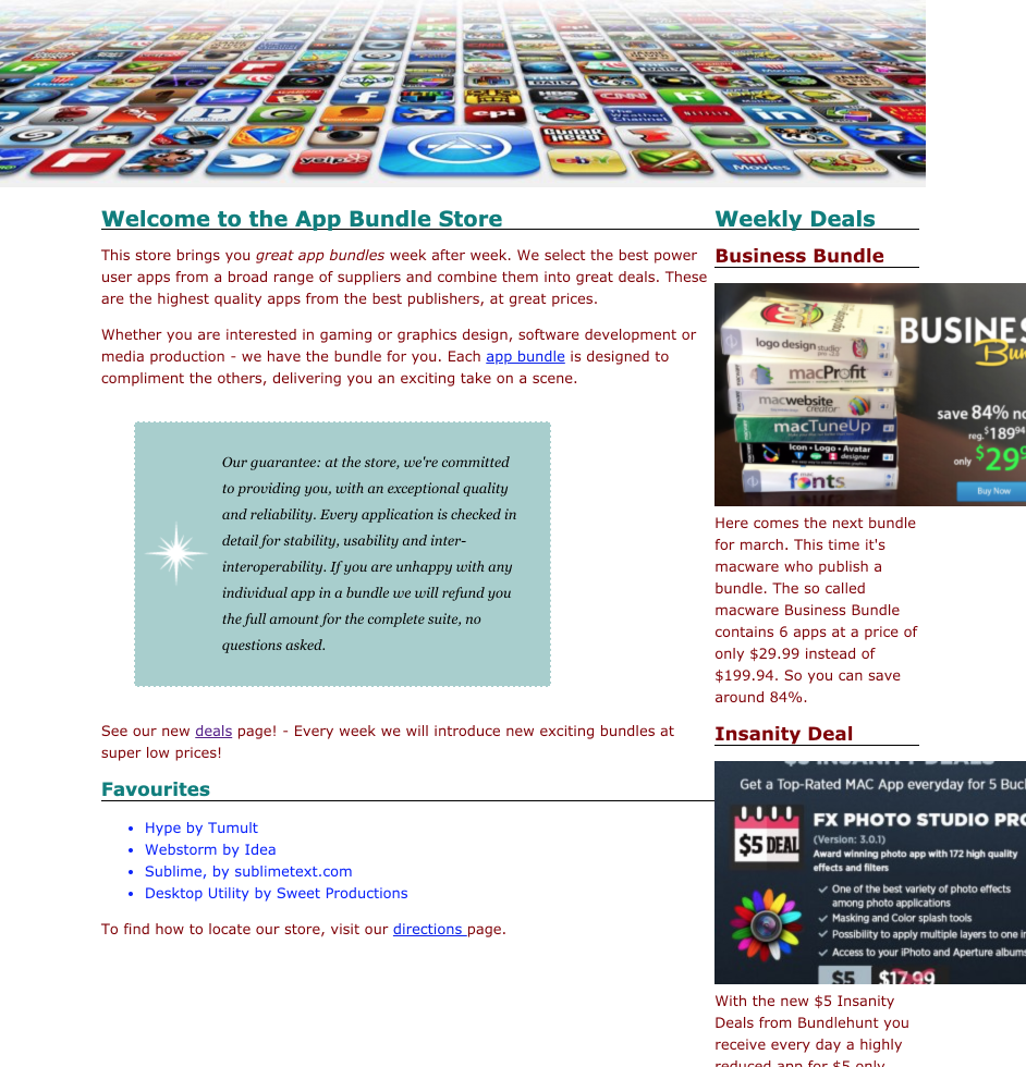
Immediately below this section, introduce this new section:
    <div>
      <h1>Weekly Deals</h1>
      <h2 class="special">Business Bundle</h2>
      <p>
        <img src="images/business.png" alt="Business Bundle"/> Here comes the
        next bundle for march. This time it's macware who publish a bundle. The so
        called macware Business Bundle contains 6 apps at a price of only $29.99
        instead of $199.94. So you can save around 84%.
      </p>
      <h2 class="special">Insanity Deal</h2>
      <p>
        <img src="images/insanity.jpg" alt="Insanity Deal"/> With the new $5
        Insanity Deals from Bundlehunt you receive every day a highly reduced app
        for $5 only with savings up to 75%. Not a real bundle but, as there are
        multiple apps for only $5 each, one new per day, for the days to come.
      </p>
      <h3>Onesoft Bundle</h3>
      <p>
        <img src="images/ondesoft.jpg" alt="One Soft Bundle"/>
        An exciting offerieng from Onesoft. It comes in at
        $199.94. So you can save around 84%. Get it today!
      </p>
    </div>
This is already wrapped in a <div>.
The page now looks like this:
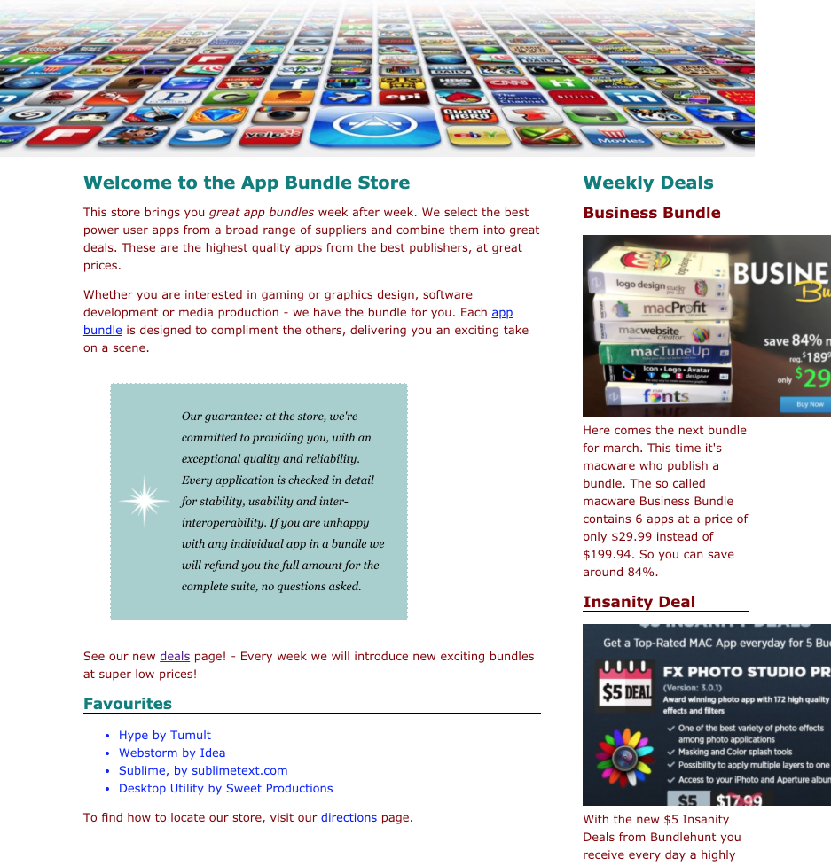
Finally, give the each of these sections an id:
    <div id="maincontent">
      ...
    </div>
    <div id="sidebar">
      ...
    </div>
This is the complete page at this stage:
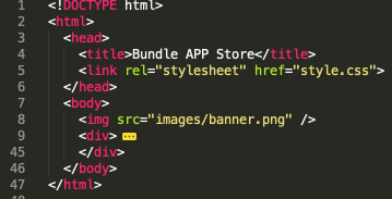
<!DOCTYPE html>
<html>
  <head>
    <title>Bundle APP Store</title>
    <link rel="stylesheet" href="style.css">
  </head>
  <body>
    <img src="images/banner.png"/>
    <div id="maincontent">
      <h1>Welcome to the App Bundle Store</h1>
      <p>
        This store brings you <em> great app bundles </em> week after week. We
        select the best power user apps from a broad range of suppliers and
        combine them into great deals. These are the highest quality apps from the
        best publishers, at great prices.
      </p>
      <p>
        Whether you are interested in gaming or graphics design, software
        development or media production - we have the bundle for you. Each
        <a href="apps.html">app bundle</a> is designed to compliment the others,
        delivering you an exciting take on a scene.
      </p>
      <p class="guarantee">
        Our guarantee: at the store, we're committed to providing you,
        with an exceptional quality and reliability. Every application is checked in detail
        for stability, usability and inter-interoperability. If you are unhappy with any
        individual app in a bundle we will refund you the full amount for the complete suite,
        no questions asked.
      </p>
      <p>
        See our new <a href="deals/deals.html"> deals</a> page! - Every week we
        will introduce new exciting bundles at super low prices!
      </p>
      <h2>Favourites</h2>
      <ul class="highlight">
        <li>Hype by Tumult</li>
        <li>Webstorm by Idea</li>
        <li>Sublime, by sublimetext.com</li>
        <li>Desktop Utility by Sweet Productions</li>
      </ul>
      <p>
        To find how to locate our store, visit our
        <a href="directions.html"> directions </a> page.
      </p>
    </div>
    <div id="sidebar">
      <h1>Weekly Deals</h1>
      <h2 class="special">Business Bundle</h2>
      <p>
        <img src="images/business.png" alt="Business Bundle"/> Here comes the
        next bundle for march. This time it's macware who publish a bundle. The so
        called macware Business Bundle contains 6 apps at a price of only $29.99
        instead of $199.94. So you can save around 84%.
      </p>
      <h2 class="special">Insanity Deal</h2>
      <p>
        <img src="images/insanity.jpg" alt="Insanity Deal"/> With the new $5
        Insanity Deals from Bundlehunt you receive every day a highly reduced app
        for $5 only with savings up to 75%. Not a real bundle but, as there are
        multiple apps for only $5 each, one new per day, for the days to come.
      </p>
      <h3>Onesoft Bundle</h3>
      <p>
        <img src="images/ondesoft.jpg" alt="One Soft Bundle"/>
        An exciting offerieng from Onesoft. It comes in at
        $199.94. So you can save around 84%. Get it today!
      </p>
    </div>
  </body>
</html>
Grid Container
The Html standards have struggled with multi-column layout ovwe many generations of browser and versions of the standard, with many contrasting approaches emerging over the years.
This has finally yielded a new standard called Grid Layout:
We will introduce this now into our page. First, one more adjustment. If we can 'fold' our page in sublime, it might look like this:
Now introduce yet another <div>, this time wrapping both existing divs:
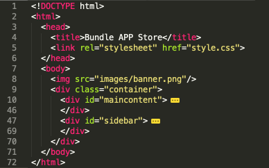
This division has the class name "container". Our body is now structured like this:
<img src="images/banner.png"/>
<div class="container">
<div id="maincontent">
...
</div>
<div id="sidebar">
...
</div>
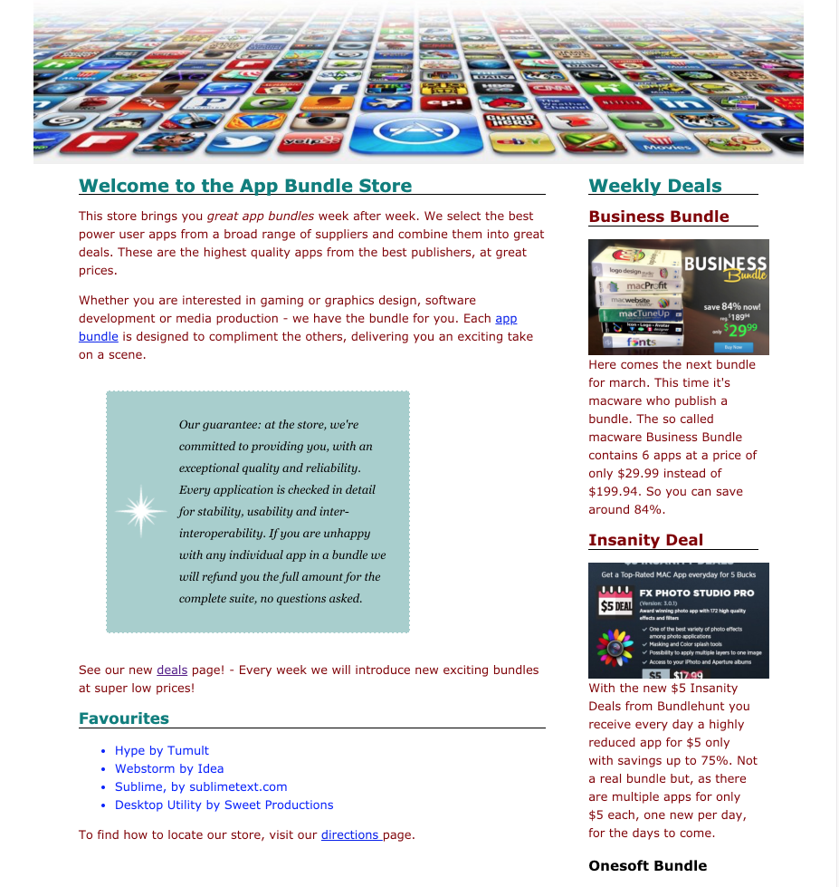
</div>Grid Styles
Include this new rule in the stylesheet:
.container {
  display: grid;
  grid-template-columns: 70% 30%;
}
Refresh the page - it should look like this:

This simple rule has divided the page into 2 columns - and automatically "maincontent" and "sidebar" into these, sized at 70% and 30% of the page.
Grid Items
The term 'Grid Container' refers to our outer enclosing div - called 'container' - in our page:
   <img src="images/banner.png"/>
   <div class="container">
     <div id="maincontent">
        ...
     </div>
     <div id="sidebar">
        ...
     </div>
   </div>
The two division contained within this - call "maincontent" and "sidebar" we can consider to be "Grid Items" - i.e. elements to be placed inside a grid according to some rules we define.
The rules for their placement are defined in the css rule we defined:
.container {
  display: grid;
  grid-template-columns: 70% 30%;
}
You will notice that the left and right margins of our page are right up against the browser window edges. We might like to strive for a more pleasing set of dimensions with the following adjustment to the rule:
.container {
  display: grid;
  grid-template-columns: 10% 60% 20% 10%;
}
This is defining 4 columns instead of 2. Reload the page and see what effect it has.
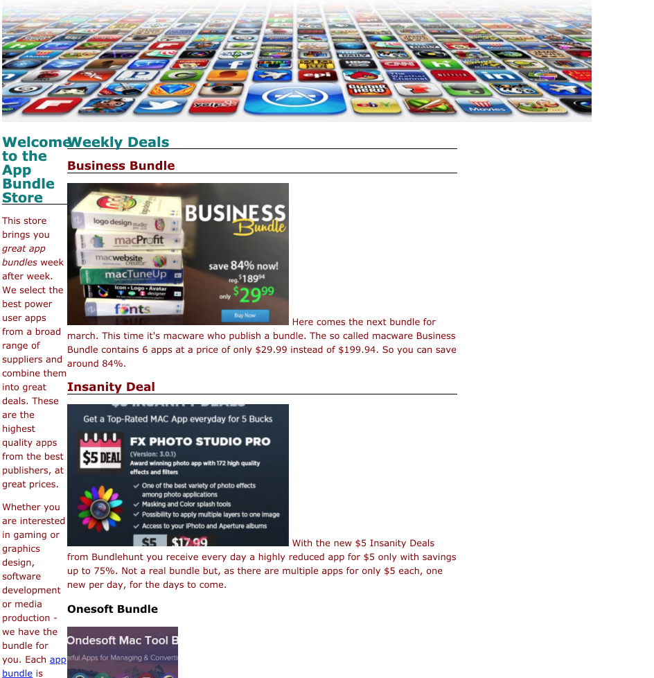
Not quite what we were looking for - out grid children went directly into the 10% and 60% columns.
Here are new rules to fix this:
#maincontent {
  grid-column-start: 2;
}

#sidebar {
  grid-column-start: 3;
}
These rules define in which column (of four) the child is to be displayed. It should look a little better now:
Here is a revised version of the container rule:
.container {
  display: grid;
  grid-template-columns: 5% 55% 20% 5%;
  grid-gap: 5%;
}
Notice we have a "grid-gap" of 5%. Also notice, we have had to 'make room' for this in the columns so that the four columns (total 85%) + the three gaps (15%) adds up to 100%.
The page now looks like this:
Still not quite finished - but almost there.
Exercise
This is the final version of the project at this stage:
Exercise
Have a look at this screen shot here:
Notice two aspects:
- The sidebar images are resized to a uniform dimension
- The banner image is centered
Try to make these changes. Your strategy might be as follows:
- define a rule targeting the side bar images
- define a different rule targeting the banner image
In those rule, apply properties to:
- resize (say the width only) the sidebar images
- center the banner image
Use classes for the selector, marking all sidebar images with one class (say "sidebar-img") and another for the banner ("banner-img").
If you are finding this a bit mysterious - then download and explore the solution project here: