Objectives
Devise a simple navigation metaphor for a web site.
Setup
This is a completed version of last weeks lab, including exercises, which extended the project to include several interlinked pages:
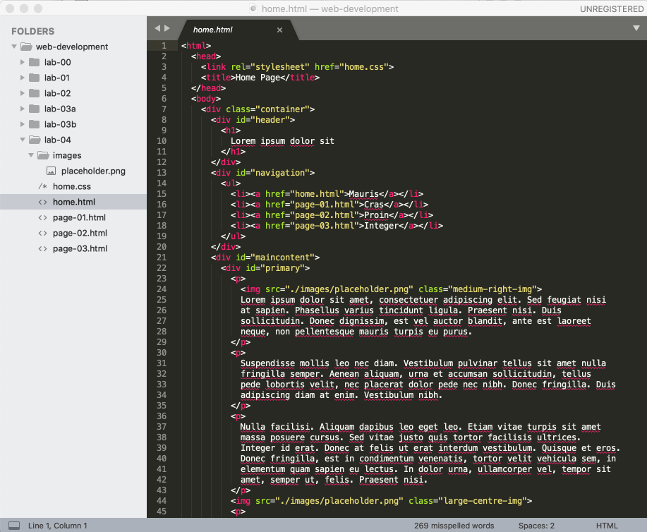
Download, unzip this project and expand it into your web-development folder. Make sure the project folder is called lab04. Your Sublime workspace should look like this:
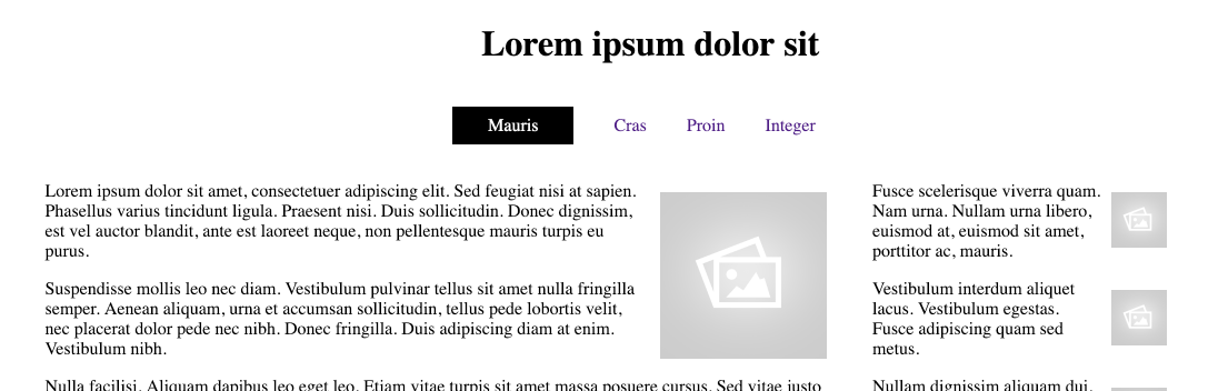
Review the site by opening the home page - it should be the same as this:
Refactor the CSS
This is the style sheet:
home.css
.container {
  display: grid;
  grid-template-columns: 5% 10% 61% 5%;
  grid-gap: 3%;
}

#header {
  grid-column-start: 2;
  grid-column-end: span 2;
}

#navigation {
  grid-column-start: 2;
}

#maincontent {
  grid-column-start: 3;
  display: grid;
  grid-template-columns: 70% 27%;
  grid-gap: 3%;
}

#primary {
  grid-column-start: 1;
}

#secondary {
  grid-column-start: 2;
}

#footer {
  grid-column-start: 2;
  grid-column-end: span 2;
}

.small-right-img {
  width: 50px;
  float: right;
  margin: 10px;
}

.medium-right-img {
  width: 150px;
  float: right;
  margin: 10px;
}

.large-right-img {
  width: 250px;
  float: right;
  margin: 10px;
}

.small-left-img {
  width: 50px;
  float: left;
  margin: 10px;
}

.medium-left-img {
  width: 150px;
  float: left;
  margin: 10px;
}

.large-left-img {
  width: 250px;
  float: left;
  margin: 10px;
}

.small-centre-img {
  display: block;
  width: 50px;
  margin-left: auto;
  margin-right: auto
}

.medium-centre-img {
  display: block;
  width: 150px;
  margin-left: auto;
  margin-right: auto
}

.large-centre-img {
  display: block;
  width: 250px;
  margin-left: auto;
  margin-right: auto
}
This is a long file, requiring scrolling to see it in full. We might find it easier to manage it we have 2 smaller sheets:
- grid.css: contains just the grid rules
- image.css: the image related rules
grid.css
.container {
  display: grid;
  grid-template-columns: 5% 10% 61% 5%;
  grid-gap: 3%;
}

#header {
  grid-column-start: 2;
  grid-column-end: span 2;
}

#navigation {
  grid-column-start: 2;
}

#maincontent {
  grid-column-start: 3;
  display: grid;
  grid-template-columns: 70% 27%;
  grid-gap: 3%;
}

#primary {
  grid-column-start: 1;
}

#secondary {
  grid-column-start: 2;
}

#footer {
  grid-column-start: 2;
  grid-column-end: span 2;
}
image.css
.small-right-img {
  width: 50px;
  float: right;
  margin: 10px;
}

.medium-right-img {
  width: 150px;
  float: right;
  margin: 10px;
}

.large-right-img {
  width: 250px;
  float: right;
  margin: 10px;
}

.small-left-img {
  width: 50px;
  float: left;
  margin: 10px;
}

.medium-left-img {
  width: 150px;
  float: left;
  margin: 10px;
}

.large-left-img {
  width: 250px;
  float: left;
  margin: 10px;
}

.small-centre-img {
  display: block;
  width: 50px;
  margin-left: auto;
  margin-right: auto
}

.medium-centre-img {
  display: block;
  width: 150px;
  margin-left: auto;
  margin-right: auto
}

.large-centre-img {
  display: block;
  width: 250px;
  margin-left: auto;
  margin-right: auto
}
We can now replace the contents of home.css with include statements:
home.css
@import url("grid.css");
@import url("image.css");
These changes will simplify working with the style sheets - as we have each focussed on a specific trait of the site.
Make sure the site works exactly the same as before.
Restructure Grid
We will restructure the page layout to a 3 column structure, with a reduced grid gap:
home.css
.container {
  display: grid;
  grid-template-columns: 5% 88% 5%;
  grid-gap: 1%;
}
This will completely disrupt the layout (try it), until we revise the column start positions:
Change the navigation to span 2 columns:
#navigation {
  grid-column-start: 2;
  grid-column-end: span 2;
}
Also adjust maincontent start column:
#maincontent {
  grid-column-start: 2;
  ...
}
Finally, we can simplify the footer rule:
#footer {
  grid-column-start: 2;
}
You should be able to view the page with the aid of the developer tools:
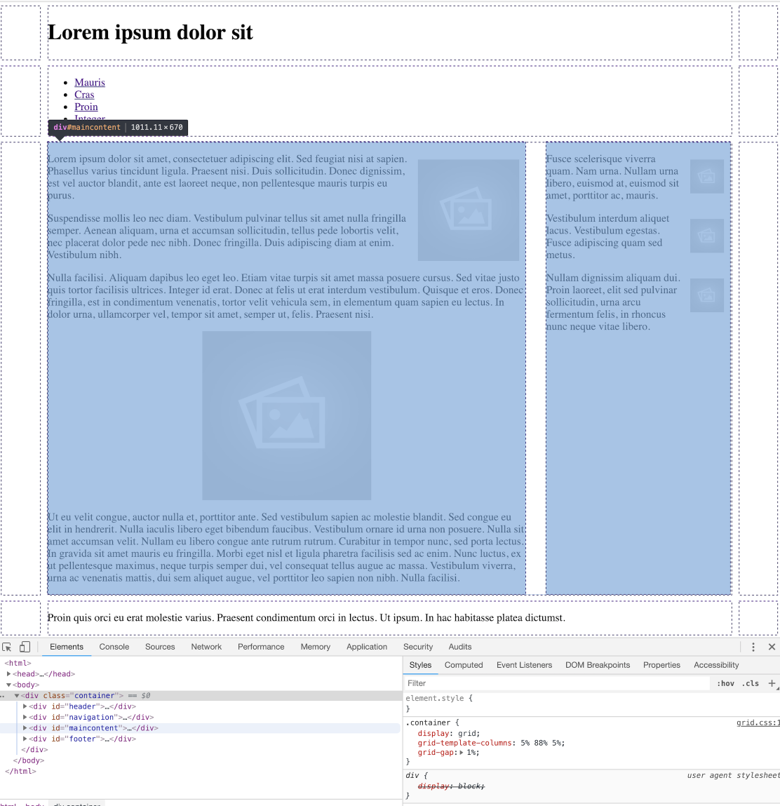
This is revealing the grid structure.
Navigation Menu
All our pages have the following navigation section:
      <div id="navigation">
        <ul>
          <li><a href="home.html">Mauris</a></li>
          <li><a href="page-01.html">Cras</a></li>
          <li><a href="page-02.html">Proin</a></li>
          <li><a href="page-03.html">Integer</a></li>
        </ul>
      </div>
In all of the pages, change this specific element:
<ul>to
<ul id="menu">So that each navigation section looks like this:
      <div id="navigation">
        <ul id="menu">
          <li><a href="home.html">Mauris</a></li>
          <li><a href="page-01.html">Cras</a></li>
          <li><a href="page-02.html">Proin</a></li>
          <li><a href="page-03.html">Integer</a></li>
        </ul>
      </div>
Create a new style sheet called nav.css, and include this rule:
ul#menu li {
  display: inline;
}
Because of the changes we have just made, we can target the <li>, making it inline instead of the the default <block> style.
Include nav.css in home.css:
home.css
@import url("grid.css");
@import url("image.css");
@import url("nav.css");
Examine the header now in a browser - it should look like this:
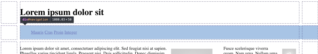
The header items are displayed on a single line.
We can further adjust the spacing between each of the <li> elements:
ul#menu li {
  display: inline;
  padding-right: 1em;
  padding-left: 1em;
}
Navigation Item
Introduce this rule into nav.css:
ul#menu a {
  text-decoration: none;
}
This will remove the 'underline' associated with links on a page:

Now we need to introduce a mechanism to reflect the current navigation context (the current page) in the navigation bar itself.
To do this, we will need additional information in the menu in each page:
home.html
        <ul id="menu">
          <li class="active"><a href="home.html">Mauris</a></li>
          <li><a href="page-01.html">Cras</a></li>
          <li><a href="page-02.html">Proin</a></li>
          <li><a href="page-03.html">Integer</a></li>
        </ul>
page-01.html
        <ul id="menu">
          <li><a href="home.html">Mauris</a></li>
          <li class="active"><a href="page-01.html">Cras</a></li>
          <li><a href="page-02.html">Proin</a></li>
          <li><a href="page-03.html">Integer</a></li>
        </ul>
page-02.html
        <ul id="menu">
          <li><a href="home.html">Mauris</a></li>
          <li><a href="page-01.html">Cras</a></li>
          <li class="active"><a href="page-02.html">Proin</a></li>
          <li><a href="page-03.html">Integer</a></li>
        </ul>
page-03.html
        <ul id="menu">
          <li><a href="home.html">Mauris</a></li>
          <li><a href="page-01.html">Cras</a></li>
          <li><a href="page-02.html">Proin</a></li>
          <li class="active"><a href="page-03.html">Integer</a></li>
        </ul>
In the above adjustments, an individual <li> is marked as active - depending on which page is displayed.
Now we can define a rule to only effect the 'active' page:
#menu li.active a {
  background: black;
  padding: .5em 2em .5em 2em;
  color: white;
}

This is the complete nav.css at this stage:
nav.css
ul#menu li {
  display: inline;
  padding-right: 1em;
  padding-left: 1em;
}

ul#menu a {
  text-decoration: none;
}

#menu li.active a {
  background: black;
  padding: .5em 2em .5em 2em;
  color: white;
}
Style folder
Finally, we can reorganise the project structure to keep all style sheets together in one folder for convenience and coherence. In the project, create a directory to hold all the stylesheets called 'css'. The move all the style sheets into this folder:
You will also need to change the <link> header element in each page to import the stylesheet from the css folder:
<link rel="stylesheet" href="css/home.css">Verify now that the site continues to work as expected.
Solution
This is the project as completed in this lab:
Exercises
Exercise 1: Centre Header and Navigation
Making changes just to nav.css, center align the header and navigation sections:
This is the property that can achieve this effect:
text-align: center;Exercises 2: Additional page
Create one additional page in the site, and tie it into the style and navigation structure already defined.