Objectives
Create a revised version of bundle-store using the Semantic UI CSS framework.
Include CSS Framework
This assumes you have completed lab 05b:
You can use your solution, or download the version above.
_layput.ejs:
The first step is replace the style sheet we have developed with an include of the framework (+ supporting javascript);
    <link rel="stylesheet" href="https://cdnjs.cloudflare.com/ajax/libs/semantic-ui/2.4.1/semantic.min.css">
    <script type="text/javascript" src="https://cdnjs.cloudflare.com/ajax/libs/semantic-ui/2.2.10/semantic.min.js"></script>
This is the compete page:
 <!DOCTYPE html>
<html>
  <head>
    <meta charset="utf-8">
    <title>Bundle APP Store</title>
    <link rel="stylesheet" href="https://cdnjs.cloudflare.com/ajax/libs/semantic-ui/2.4.1/semantic.min.css">
    <script type="text/javascript" src="https://cdnjs.cloudflare.com/ajax/libs/semantic-ui/2.2.10/semantic.min.js"></script>
  </head>
  <body>
    <img src="images/banner.png" class="large-centre-img">
    <section class="container">
      <%- include('./partials/_header.ejs'); %>
      <%- yield %>
      <%- include('./partials/_footer.ejs'); %>
    </section>
  </body>
</html>
As we are not longer using our style sheet, we might simplify our html by removing all 'id=' and 'class=' attributes - apart from the 'id=' used inside the <nav> element - from all pages.
Remember you must browse using harp:
$ harp server
------------
Harp v0.29.0 – Chloi Inc. 2012–2015
Your server is listening at http://localhost:9000/
Press Ctl+C to stop the server
------------
Having removed our own style sheet, the index page looks like this:
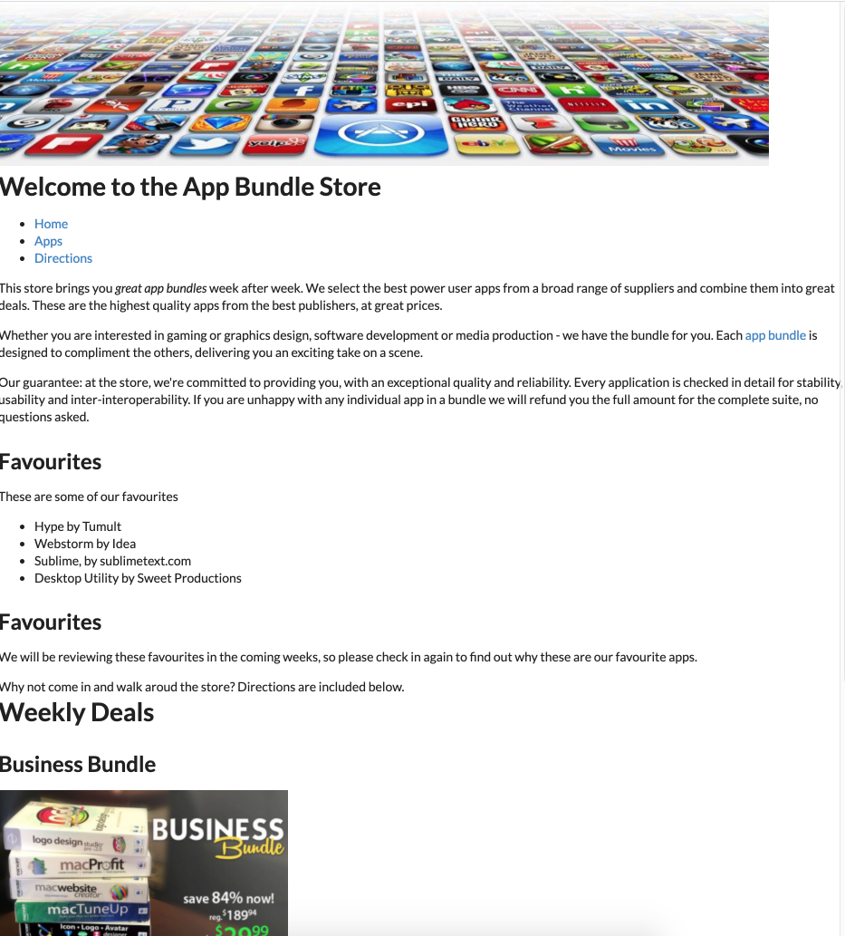
It is back to being unstyled again.
Container
The CSS framework we are using is documented here:
Select 'Menu' to reveal the element list:

We will be using perhaps 6 or 7 of these components.
The first one we will implement is container:
This is introduced in the _layout.ejs:
_layout.ejs
  ...
    <section class="ui container">
  ...
All we have done is revise the class to be "ui container". This is the Semantic-ui pattern for selecting a class from its framework.
Make sure the change now, and make sure it adjust the margins like this:
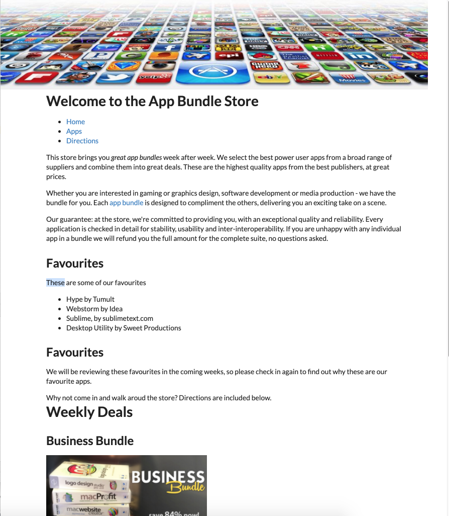
Review the documentation again to get a general understanding of the Container style:
Grid
We have carefully used the new grid CSS standard in our project, but have now removed it to use Semantic UI. This framework has its own grid system:
This is somewhat simpler to master, and has a number of features our implementation did not address.
Here is how we might revise index.html (not showing the contents of the article and the aside):
index.ejs
<%- include('./partials/_nav.ejs', {id : "home"}); %>
<main>
  <div class="ui grid">
    <div class="ui twelve wide column">
      <article>
      ...
      </article>
    </div>
    <div class="ui four wide column">
      ...
    </div>
  </div>
</main>
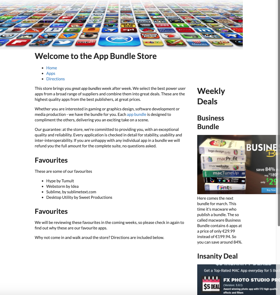
We are using the 16 grid system defined by Semantic-UI - and defining a 12 - 4 ratio between our main article and the included aside.
This is the complete page:
index.ejs
<%- include('./partials/_nav.ejs', {id : "home"}); %>
<main>
  <div class="ui grid">
    <div class="ui twelve wide column">
      <article>
        <p>
          This store brings you <em> great app bundles </em> week after week. We select the best power user apps from a
          broad range of suppliers and combine them into great deals. These are the highest quality apps from the best
          publishers, at great prices. </p>
        <p>
          Whether you are interested in gaming or graphics design, software development or media production - we have
          the bundle for you. Each <a href="apps.html">app bundle</a> is designed to compliment the others, delivering
          you an exciting take on a scene. </p>
        <p>
          Our guarantee: at the store, we're committed to providing you, with an exceptional quality and reliability.
          Every application is checked in detail for stability, usability and inter-interoperability. If you are unhappy
          with any individual app in a bundle we will refund you the full amount for the complete suite, no questions
          asked. </p>
        <h2>Favourites</h2>
        <p> These are some of our favourites </p>
        <ul>
          <li>Hype by Tumult</li>
          <li>Webstorm by Idea</li>
          <li>Sublime, by sublimetext.com</li>
          <li>Desktop Utility by Sweet Productions</li>
        </ul>
        <h2>Favourites</h2>
        <p> We will be reviewing these favourites in the coming weeks, so please check in again to find out why these
          are our favourite apps.</p>
        <p> Why not come in and walk aroud the store? Directions are included below. </p>
      </article>
    </div>
    <div class="ui four wide column">
      <%- include('./partials/_secondary.ejs'); %>
    </div>
  </div>
</main>
The page should look like this now:
Segment
In the framework, the segment is a key aspect of proportional layout:
In index, we can make the main article a segment:
index.ejs
  ...
      <article class="ui segment">
        <p>
          This store brings you <em> great app bundles </em> week after week. We select the best power user apps from a
          broad range of suppliers and combine them into great deals. These are the highest quality apps from the best
 ...
Similarly in the aside:
_secondary.ejs:
<aside class="ui segment">
  <h1>Weekly Deals</h1>
  <h2 class="special">Business Bundle</h2>
  ...
This draws bounding boxes around these sections, with additional padding and margins:
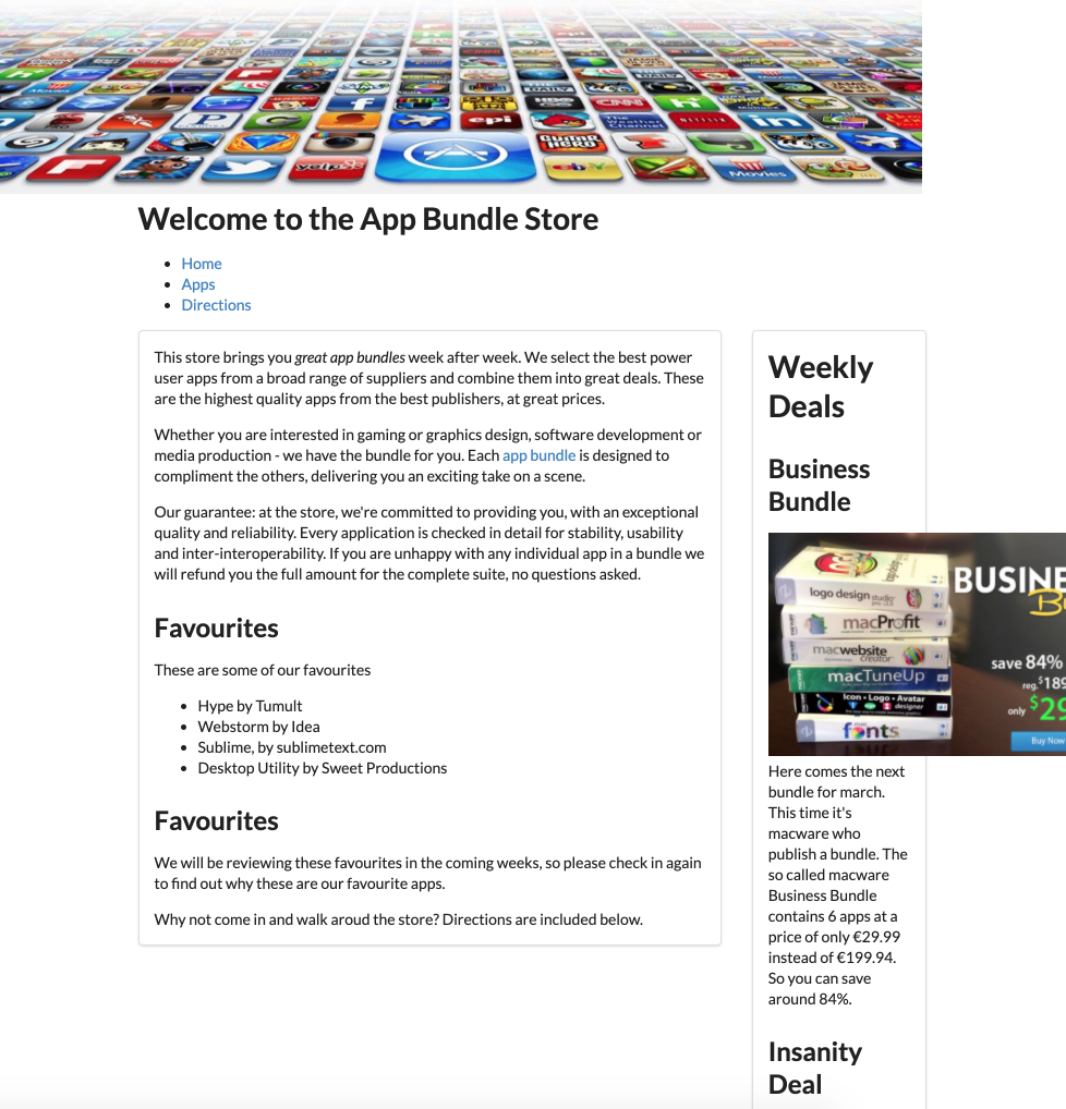
There are many variations to segments presented in detail in the documentation. For instance, the 'stacked' and 'piled' variations:
We can make the article 'raised' and the aside 'stacked' just by including the named variant in the class:
index.ejs
  ...
      <article class="ui rasied segment">
        <p>
          This store brings you <em> great app bundles </em> week after week. We select the best power user apps from a
          broad range of suppliers and combine them into great deals. These are the highest quality apps from the best
 ...
Similarly in the aside:
_secondary.ejs:
<aside class="ui stacked segment">
  <h1>Weekly Deals</h1>
  <h2 class="special">Business Bundle</h2>
  ...
These are subtle differences you will need to look closely to verify (try turning them on and off to see the difference)
Images
Currently our images are not being resized proportionally at all. Semantic UI has a range of image features:
Open _secondary.ejs and extend the image elements to have a new class 'ui image'
_secondary.ejs
...
  <img src="images/business.png" alt="Business Bundle" class="ui image">
...
  <img src="images/insanity.jpg" alt="Insanity Deal" class="ui image">
...
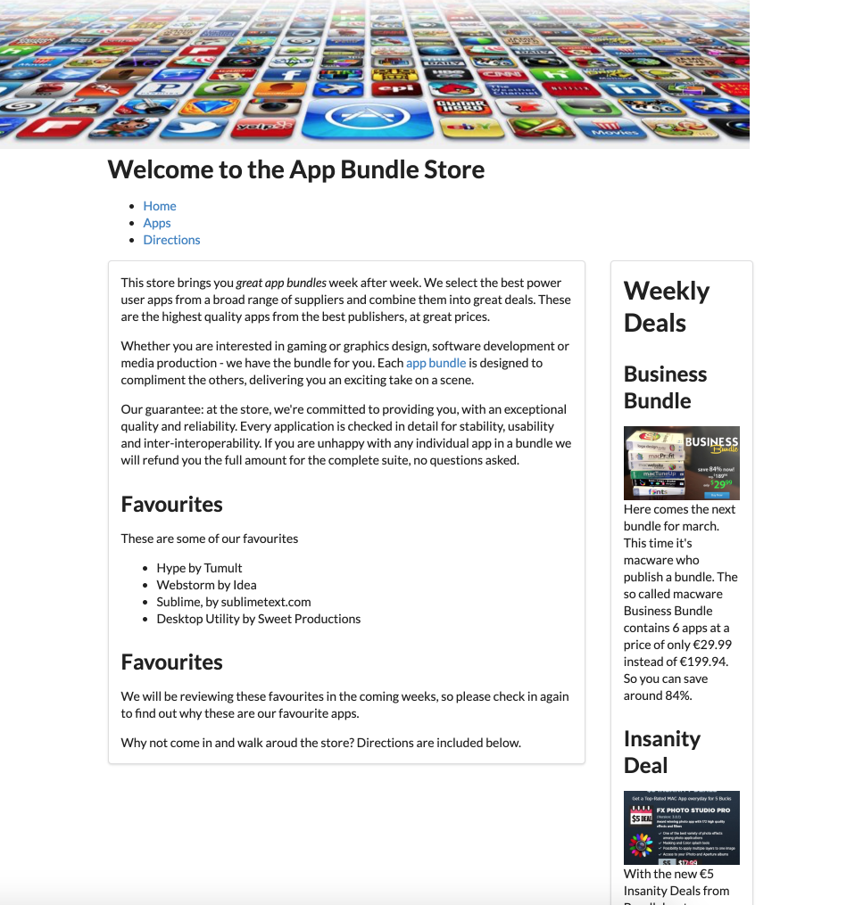
The images are now resized to something more proportional to the context:
We can also impose some shape on the images:
Try this:
...
  <img src="images/business.png" alt="Business Bundle" class="ui image">
...
  <img src="images/insanity.jpg" alt="Insanity Deal" class="ui image">
...
Menus
Semantic UI includes a comprehensive set of navigation controls. The simplest one to get used to is the menu:
Here is a revised version of _nav.ejs which uses this feature:
_nav.ejs
<nav>
  <ul class="ui three item menu">
    <li id="home" class="ui item"><a href="index.html">Home</a></li>
    <li id="apps" class="ui item"><a href="apps.html">Apps</a></li>
    <li id="directions" class="ui item"><a href="directions.html">Directions</a></li>
  </ul>
</nav>

<script>
  document.querySelector("#<%= id %>").classList.add("active")
</script>
The only changes have been to include new classes in the <ul> and <lo> elements. Try it now:
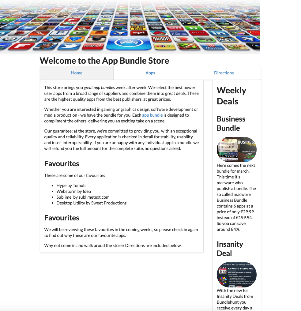
The navigation should work as before.
The tabular menu might be worth exploring:
<nav>
  <ul class="ui three item tabular menu">
Solution
This is the project at this stage:
Exercises:
Browse this version of the site here:
This has a few extra features specifically Cards:
This is the documentation here:
See if you can introduce a card into the site now.
You might want to peek at the solution here:
... to get the general idea.